.jpg)





Say you run a software company. Good product, real customers, a small team that gets along. You raise some money, and the first thing you do is what most founders do right after a raise: you redesign the website. New colours, cleaner fonts, maybe a nice little animation on the homepage. It looks great.
Six months later, nothing has moved. Same number of signups. Same slow trickle of demo requests. And you're sitting there wondering why a website that looks so much better isn't actually doing more.
Here's the question that usually explains it. If a stranger landed on your homepage right now and left after five seconds, would they know who it's for? For most companies, the honest answer is no. And that's not a design problem. That's the real problem, and no font or animation is going to fix it.
A website isn't really a design project. It's an argument. Every single person who lands on your page is quietly asking one thing: is this for me, and why should I believe it? If the page doesn't answer that fast, nothing else about it matters much.
This is what people mean when they say a website should be built around positioning instead of just branding. Once you see the difference, it's hard to unsee.
So what does that actually mean?
Before anyone opens a design tool, before a single button gets placed, there's a decision that has to happen first: who exactly is this for, and why do they pick you over everyone else doing something similar? That decision is positioning. It has nothing to do with colours or layout. It's the answer to who you're really trying to reach and what makes you the right choice for them. Get that answer right, and the words on your site practically write themselves. Get the words right, and design's only job becomes making those words impossible to miss.
Most websites get built the other way around. Someone picks a template, writes copy that sounds fine but says nothing specific, and calls it finished. That's why so many software company homepages read like they were written by the same person. "The all-in-one platform for modern teams." Sounds nice. Means nothing. Could belong to four hundred different companies.
Slack is a good example of getting this order right. Before any visual polish, the whole site was built around one clear idea: work chat that replaces messy email threads for teams. That single decision is why the homepage never feels like it's trying to be everything to everyone.

Ask The People Who Already Believe In You
Start with your best customers. Not your biggest ones, your best ones, the people who bought fast, use the product constantly, and would genuinely miss it if you shut down tomorrow. Talk to five of them. Ask why they picked you. Ask what almost stopped them from buying. A pattern shows up fast: a similar-sized company, a similar role, and a similar problem keeping them up at night.
That pattern has a name, even if the name sounds fancier than it is. It's called your ideal customer profile, or ICP. It's just a clear picture of the exact kind of company and person who gets the most value from what you built. Once you know that, your homepage stops trying to talk to everyone and starts talking to one specific person. Strangely, that's usually when more people start listening, not fewer.
There's a flip side worth thinking about too. It helps just as much to know who you're not for. Every company ends up with customers who technically could use the product but probably shouldn't have bought it. They take forever to close, argue over price, and leave within a few months. Being honest about that group, even just internally, makes it much easier to write a homepage that speaks clearly to the right person instead of trying to please everyone.
Why looking good and being clear aren't the same thing
A website can be genuinely well designed and still not say who it's for. Good design doesn't fix a vague sentence. It just makes the vague sentence look nicer.
This isn't a small or rare issue either. Groups that study software company growth have pointed out for years that unclear homepage messaging is one of the biggest reasons people leave a site without signing up. It's rarely the visuals holding people back. It's confusion about who the product is actually for.
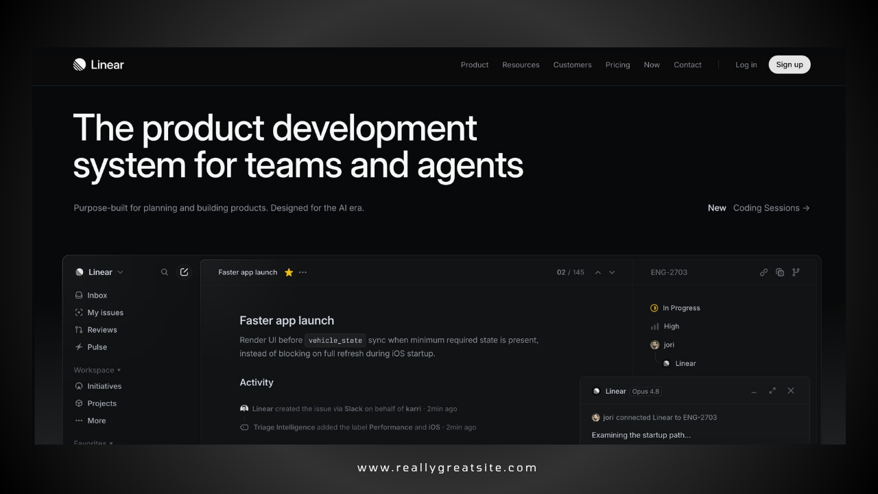
Some companies get this exactly right, and you can feel it the second you land on their page. Linear, the project tracking tool, built its entire homepage around one simple argument: other tools in this space are slow and cluttered, and Linear is fast, and you feel that speed the moment the page loads, before you've even read a single word. Webflow does something similar for its own space, building its site around one idea: you shouldn't have to choose between visual design freedom and real technical control. Neither company needed clever tricks to make the point. They needed clarity first. Design just carried it the rest of the way.

What building it properly actually looks like
Strip away the fancy language and it's a simple sequence, done in order.
First, figure out your real ideal customer by studying your best existing customers, not by guessing.
Second, get honest about who you're not for, even if it feels uncomfortable to admit some past customers were never a great fit.
Third, write one plain sentence that captures why your ideal customer should pick you over every other option. It never has to appear on the site word for word, but every headline should trace back to it.
Fourth, turn that sentence into an actual homepage structure: one main headline, a supporting line under it, a few sections proving the point, one honest comparison against alternatives, and one clear next step for the visitor.
Fifth, only now bring in the visual design, the colours, the layout, and the animation because now everything being designed actually has a job to do instead of just looking nice.
Sixth, and this step gets skipped constantly, show the homepage to someone who's never heard of your company and give them five seconds. If they can't tell you who it's for, go back and fix that before touching anything else.
Do those steps in that order, and something shifts. The website stops being decoration and starts doing real work, the kind of work that used to only happen on a live sales call.
Why this matters more as you grow
Early on, most founders can get away with a weak website because they're closing deals personally, hopping on calls, and charming people directly. That works fine at the start. It stops working once you're growing faster than you can personally sell. At that point, more and more people decide, entirely on their own, whether you're worth talking to, just by looking at your site. If it can't make that case without you in the room, you're leaving growth on the table.
Where this usually goes wrong, and what actually fixes it
Here's the honest, slightly frustrating part. Plenty of founders spend real money on a redesign, get something sharp looking, and see no change in signups or demo requests. That's not bad luck. It's usually because the agency they hired knows how to make things look good but was never asked, and never offered, to figure out who the site should actually be speaking to.
That's the gap Minute Creative was built to close. We start by nailing your ideal customer, who you're not for, and the one argument your site should make before touching layout or design. That thinking-first approach is why the sites we build for growing software companies actually work, not just look good. Book a call today.
.png)
