

SettleSmart
SettleSmart is a modern real estate brand focused on delivering a faster, smarter way to find, buy, or sell homes. With expert guidance and a streamlined platform, SettleSmart turns real estate dreams into reality.

Introduction
SettleSmart, a growing real estate company, aimed to refresh their website to better serve their audience and enhance the brand’s online presence.
To stay competitive in the real estate industry and improve the user experience, SettleSmart set three primary objectives for their website redesign project:
Objectives
1. Deliver a Superior User Experience
By creating a streamlined, intuitive layout, SettleSmart aimed to help users easily navigate property listings and find relevant information without friction.
2. Increase Conversion Rates
Through a modern, engaging design and strategically placed calls to action, SettleSmart sought to encourage more users to engage with their services, ultimately boosting conversion rates.
3. Optimize for Mobile Responsiveness
With mobile browsing on the rise, SettleSmart’s new site needed to perform seamlessly across devices, ensuring a positive experience for all users regardless of how they access the site.
The Challenges
Following are the challenges we are helping them with to overcome these obstacles and achieve their desired state.
1. Low Engagement Rate
SettleSmart’s previous website struggled to engage visitors, resulting in limited interactions and low time-on-page metrics.
2. High Bounce Rate
Many visitors were leaving the site almost immediately, a clear indicator that the site was not meeting user expectations. The outdated design and lack of user-friendly navigation created a frustrating experience, making it difficult for users to locate relevant content
3. Poor Loading Times
Slow loading times can frustrate visitors and cause them to abandon the site. SettleSmart’s previous website was hampered by long load times, negatively impacting user satisfaction and search engine performance.
4. Differentiating SettleSmart from Competitors
In a highly competitive real estate market, it’s crucial for brands to stand out. SettleSmart needed to convey its unique selling points (USPs) in a way that clearly differentiated it from other real estate platforms. By highlighting their customer-first approach and integrating trust-building elements such as client reviews and badges, we could position SettleSmart as a reliable and distinct choice for homebuyers, sellers, and renters.
5. Integrating CRM Seamlessly
Effective lead management is critical for any real estate business. To streamline follow-ups and nurture client relationships, SettleSmart required a seamless integration between the website and their CRM. This integration needed to work smoothly behind the scenes, allowing users to engage with the site naturally while ensuring that potential leads were automatically captured for the sales team.
6. Creating a Streamlined, User-Friendly Navigation
A clear, intuitive navigation system is essential for keeping visitors engaged and guiding them through the site. To reduce the high bounce rate, we needed to design a simplified navigation structure that would help users quickly locate information on buying, selling, or renting properties without feeling overwhelmed. By ensuring a smooth user journey, we aimed to create a positive, hassle-free experience for every visitor.
Research
To create a website that resonated with SettleSmart’s target audience, we conducted thorough research into competitor sites, industry trends, and user preferences in real estate. Our goal was to identify opportunities where SettleSmart could stand out and deliver a more engaging, user-friendly experience
Competitor Analysis
Through an in-depth competitor analysis, we identified key strengths and weaknesses in similar real estate platforms. This allowed us to craft a website for SettleSmart that highlighted their unique offerings and built stronger trust with users through elements like testimonials, clear navigation, and a modern design that outshined the competition.


Ideation
Building on our research, we developed concepts that prioritized user experience, mobile responsiveness, and trust-building features. Our focus was to design a clean, intuitive site layout for SettleSmart that not only looked appealing but also guided users effortlessly through buying, selling, and renting options.
Low fidelity Wireframes
We created detailed wireframes to map out SettleSmart’s user journey, ensuring that every interaction was intuitive and accessible. This stage allowed us to fine-tune the layout and flow, making certain that users could easily navigate property options and key information with minimal clicks.

Style Guide
To ensure brand consistency, we developed a style guide for SettleSmart that included a cohesive color palette, typography, and visual elements aligned with their brand identity. This guide provided a foundation for a polished, professional look that builds trust and enhances user experience across the website.

Final Design
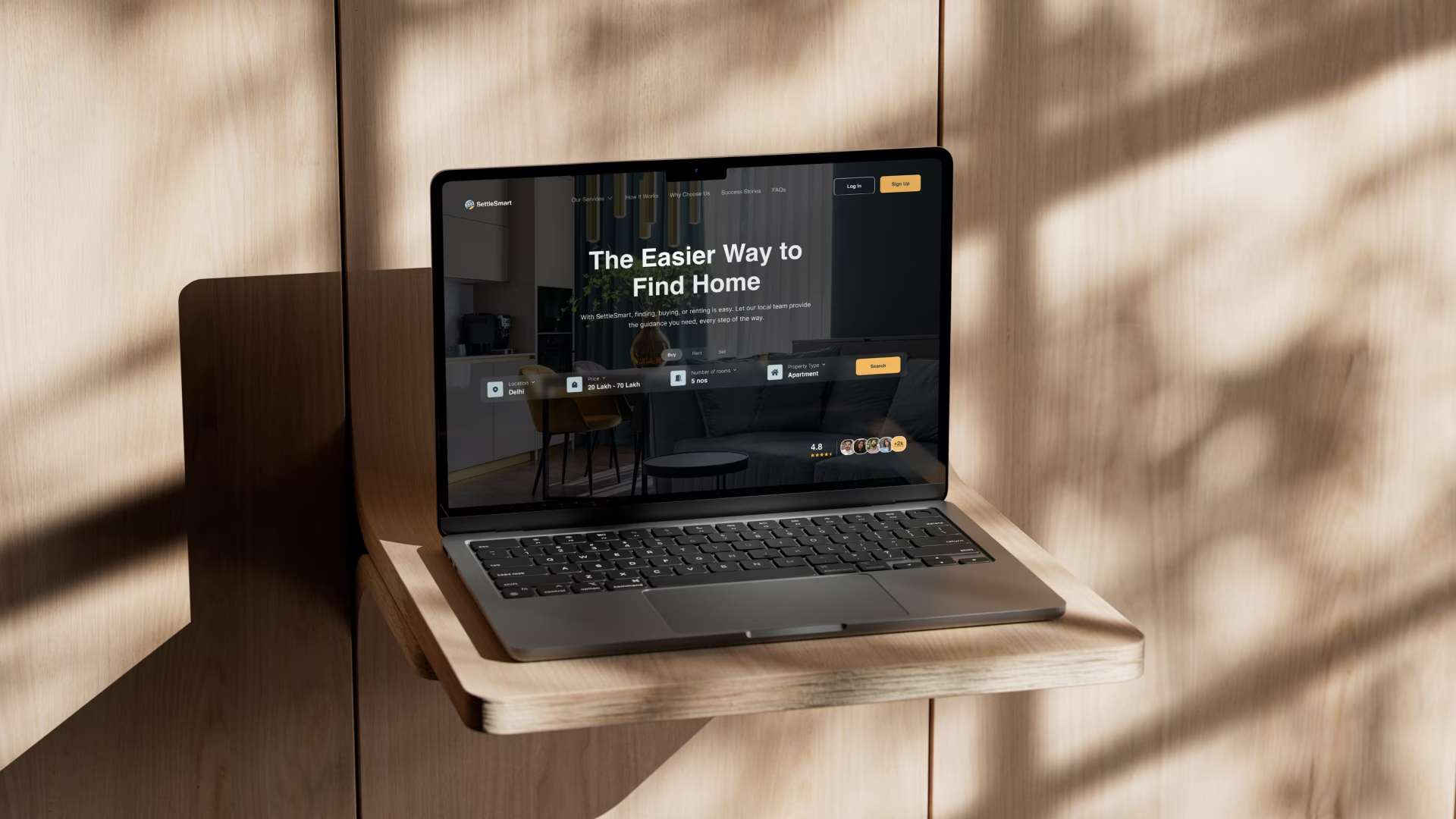
The final design for SettleSmart’s website combines modern aesthetics with an intuitive, user-centered layout. Each page features streamlined navigation, impactful visuals, and strategically placed trust elements like testimonials and badges.


