

Coasters
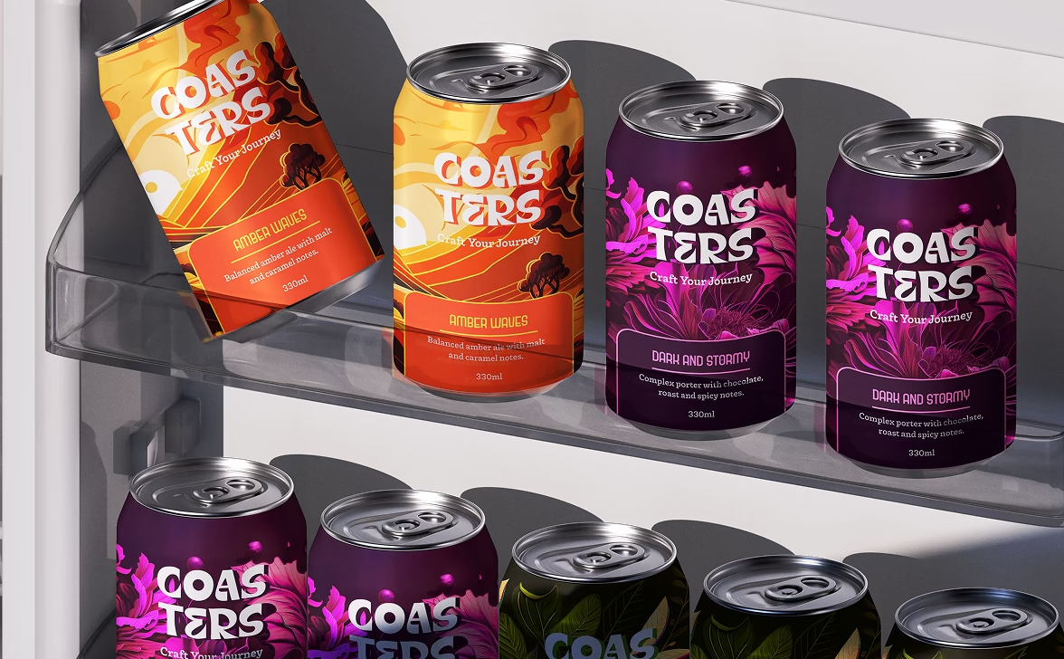
Coasters is a trailblazing brand with a vision to introduce a revolutionary craft beer experience that empowers young, energetic individuals aged 21-35 to embrace a vibrant and playful lifestyle.


Problem
Coasters faced a challenge in effectively reaching and engaging its target audience of young, energetic individuals aged 21-35. The brand desired to convey a sense of playfulness and excitement through its website, but struggled to capture the attention and interest of its intended customers.
Solution
The main focus was on creating a visually appealing and user-friendly interface. The design incorporated vibrant colors, engaging imagery, and playful graphics to effectively convey the brand's energetic spirit.
Research
Competitive Analysis
Through analyzing the competition in the market, we gained valuable insights into the industry and the design styles used by other companies to attract their customers. This deeper understanding allowed us to visualize how our website should appeal to our target audience. Our study not only encompassed other website designs in the same industry but also examined websites of various alcohol brands.


By conducting this comprehensive analysis, we identified design trends, user interface elements, and visual aesthetics that resonated well with customers in the alcohol industry. We assessed factors such as color schemes, typography choices, layout structures, and navigation patterns employed by successful websites inthe market.
Insights From Audit

Synthesising the Data
Wireframes and Iterations
To create an optimal website experience, Coasters used wireframes and iterative design processes. Feedback was collected and integrated to make continual improvements. Wireframes visually depicted the website's layout, providing a clear understanding. Iterative design allowed for ongoing refinements that aligned with Coasters' playful and vibrant brand identity. This collaborative approach resulted in a final product that effectively conveyed the brand's objectives, resonated with the target audience, and provided a seamless user experience.

Design and Deliver
Design System
The design system for Coaster's website embodies the brand's personality, which is creative, intuitive, brilliant, energetic and rebellious. It adopts a modern and visually appealing look, using a dynamic color palette. The typography is carefully chosen for readability, while imagery and graphics evoke energetic, rebellious, and joyous experience.

Final Design


Handoff and QA
After completing the design phase, the designs were handed over to the development team for implementation. To maintain the high standards and expectations set during the design phase, we will remain closely involved throughout the development process. Our team will regularly communicate with the developers to ensure the final product aligns with our vision and goals.
In addition, we will conduct thorough quality analysis to ensure the product meets our standards in terms of functionality, user experience, and overall quality. Our goal is to deliver an exceptional product that exceeds client expectations and provides a seamless user experience.


