

AnchayilKumar
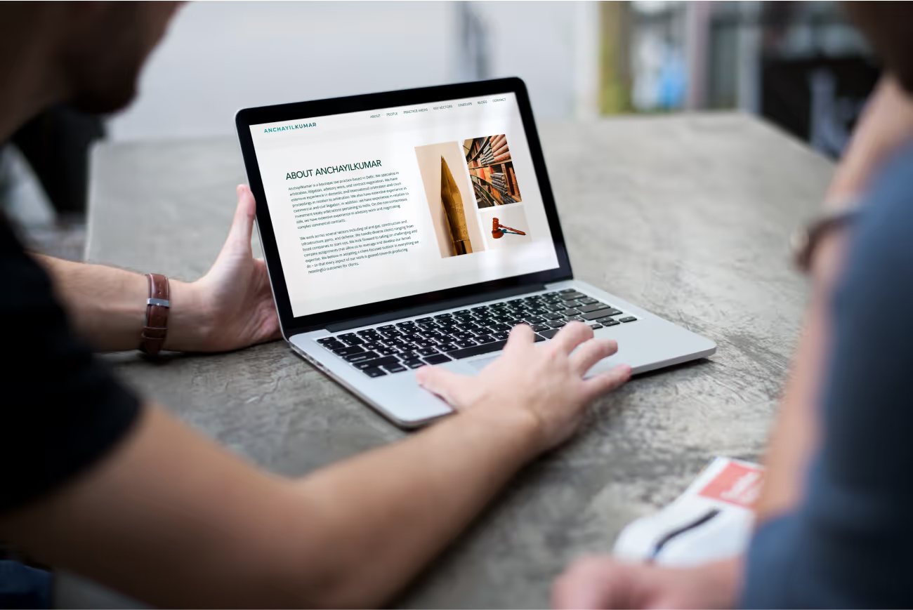
AnchayilKumar, a boutique law firm based in Delhi, India, needed a new website to establish their online presence and attract new clients. They desired a website that would effectively showcase their expertise and convey their client-focused approach.
Understanding The Needs
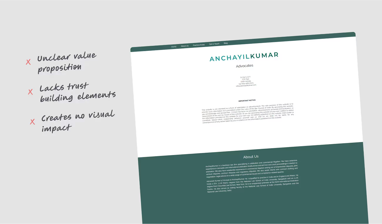
AnchayilKumar's existing website likely lacked a clear value proposition, user-friendly navigation, and a design that instilled trust and confidence in potential clients. The new website needed to address these issues and:
- Clearly communicate AnchayilKumar's areas of practice and experience.
- Demonstrate their client-centric approach.
- Project a professional and trustworthy image.
- Provide a user-friendly experience for potential clients seeking legal services.
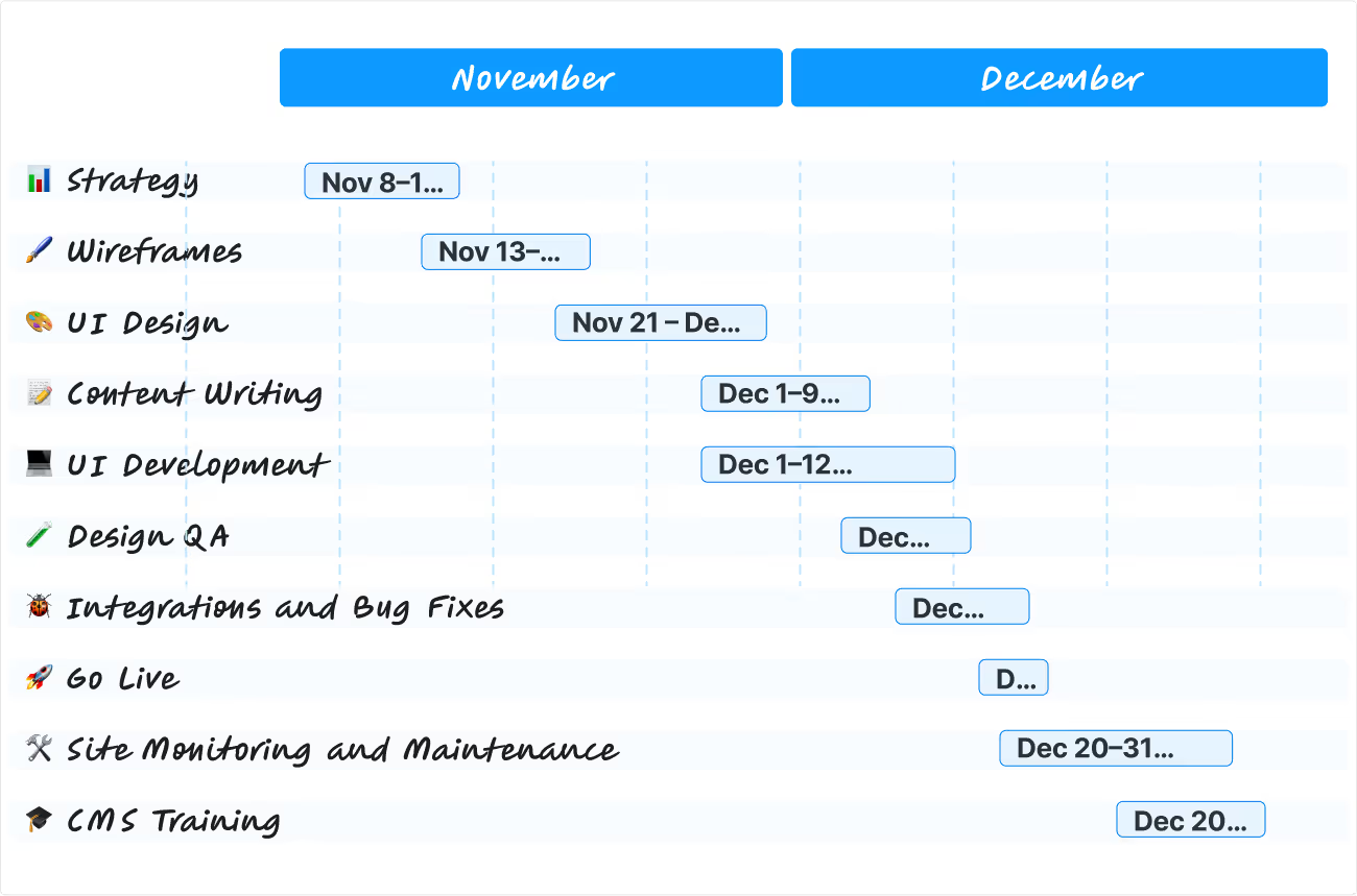
Bridging the Gap
We designed a user-friendly and informative website to serve as the foundation for AnchayilKumar's online presence. The website highlights their expertise, client focus, and inspires trust in potential clients.
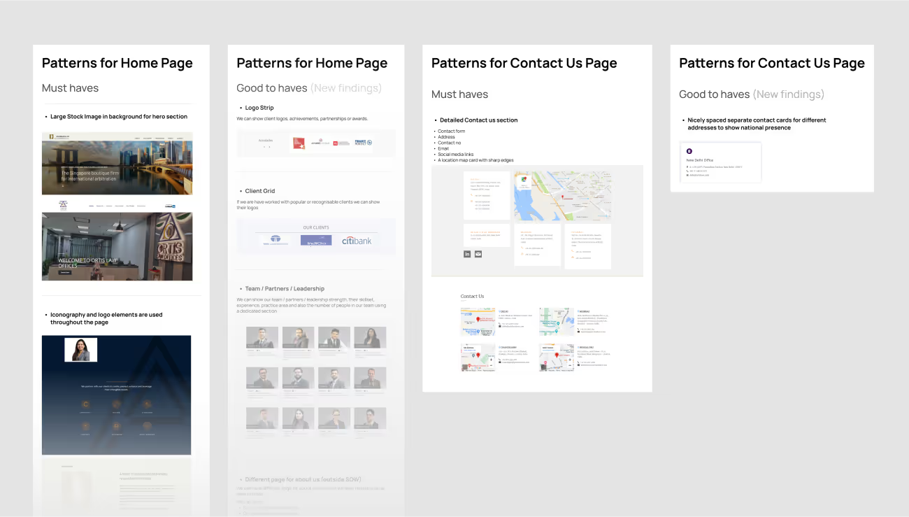
Research & Analysis
To create a website that effectively resonated with their target audience, we conducted in-depth research. This research focused on understanding AnchayilKumar's experience and areas of expertise, along with the legal sectors they serve (oil and gas, construction, etc.).
Competitor Analysis
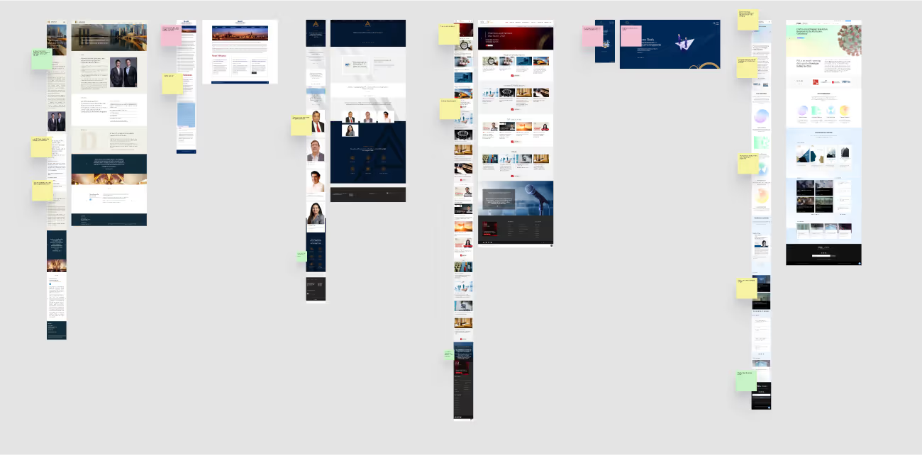
We analyzed websites of other prominent law firms in Delhi to understand best practices in design elements, content structure, and user experience for legal service websites. This research informed the development of a website that would effectively compete within the online legal landscape.
Ideation
To improve the user experience, we carefully structured the information to make itas useful as possible. Our primary goal was to make it easy for users to find the information they needed while clearly communicating our core message.
We aimed to create a smooth and user-friendly experience by focusing on how information is organized and presented. This would enable seamless navigation, as well as easy access and communication of the critical information required to convert traffic into leads.
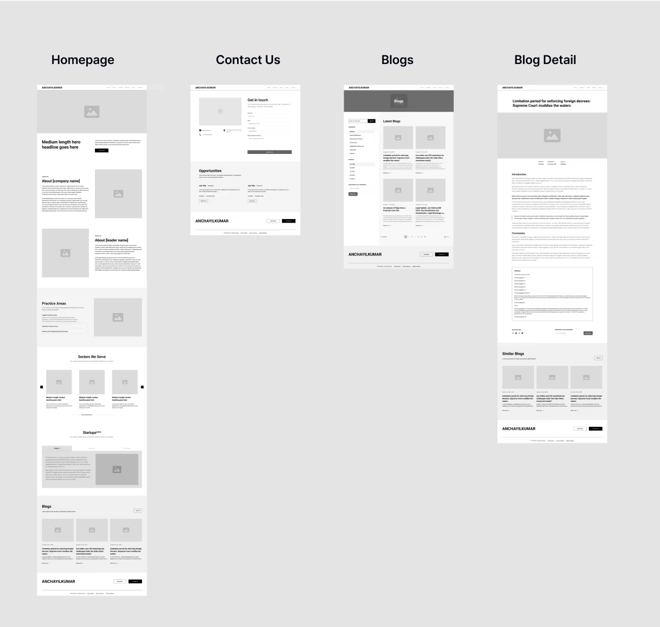
Low fidelity wireframes
We created low-fidelity wireframes to define the website's overall structure, navigation flow, and content hierarchy. This ensured a user-centric design that prioritized easy access to information and a seamless user experience for potential clients unfamiliar with the firm.
Style Guide
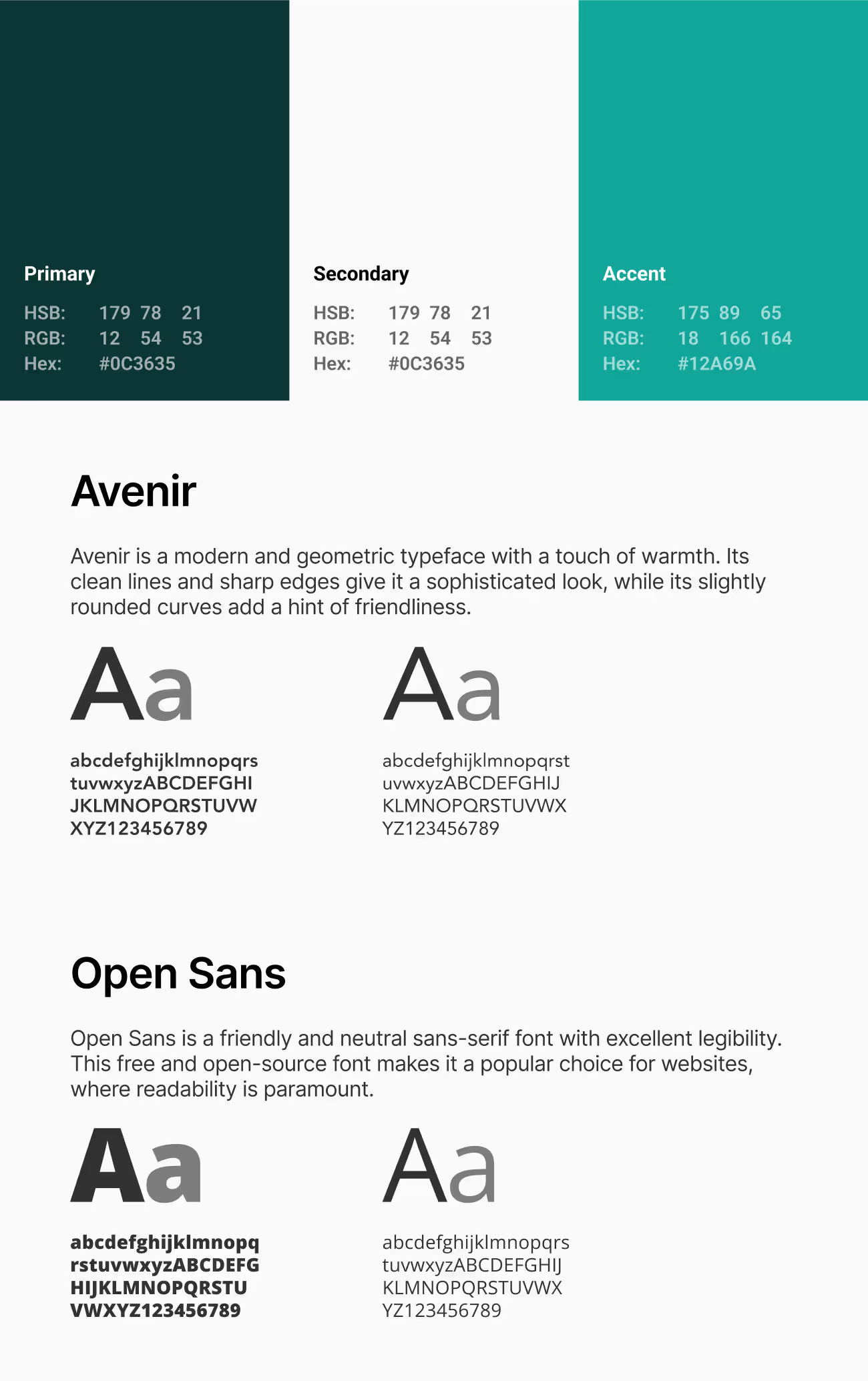
We developed a style guide that defined the website's visual identity, including color palette, typography, and imagery. The style guide ensured a consistent and professional brand experience across the website, establishing a strong first impression for visitors.
Bringing the Vision to Life
The final website design incorporates the following elements:
- Clean and modern layout: The user-friendly layout is easy to navigate and visually appealing, fostering a positive first impression.
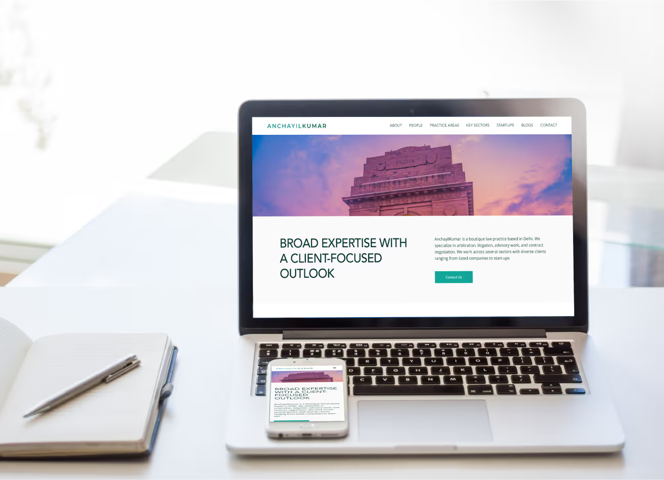
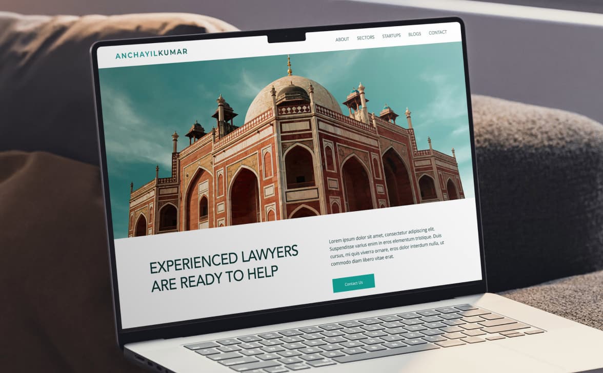
- Compelling hero section: A prominent hero section clearly communicates AnchayilKumar's value proposition and includes a call to action, encouraging visitors to learn more or contact the firm.
- Clear and concise information: The website provides clear and concise information about AnchayilKumar's areas of practice, experience, and team members, effectively communicating their expertise.
