.png)


Most SaaS founders assume that if the product is good, people will sign up. But here is what actually happens: a visitor lands on your homepage, reads a vague headline, does not understand what the product does or who it is for, and quietly leaves. They never even reach the signup button.
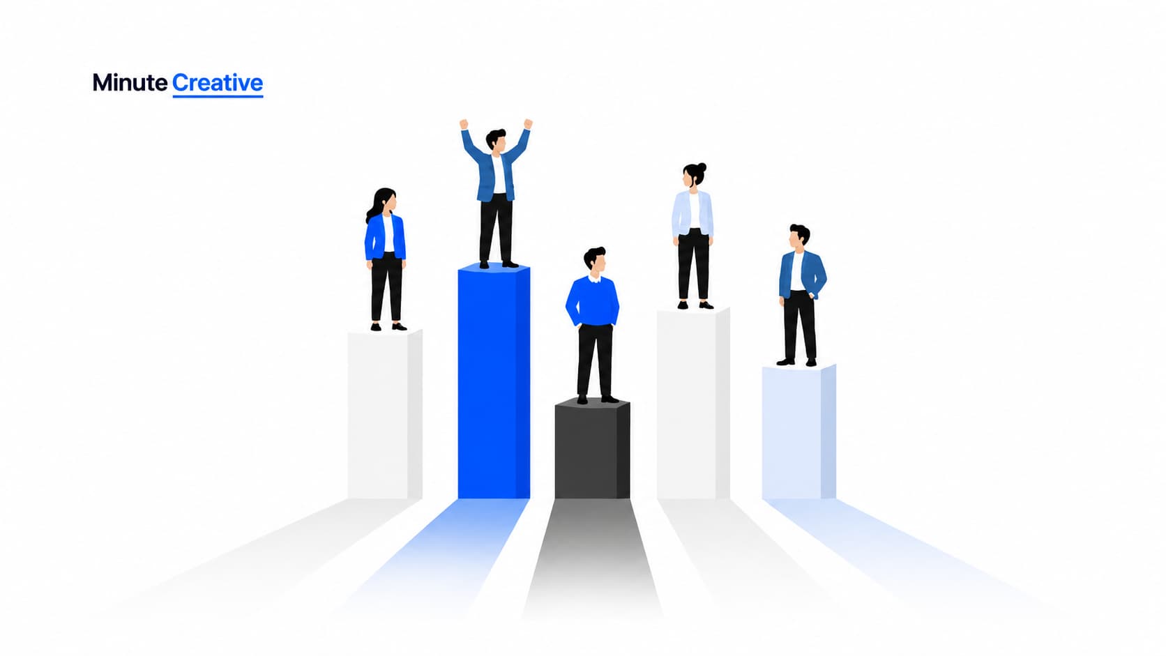
According to OpenView Partners' 2022 SaaS Benchmarks report, the median freemium conversion rate across B2B SaaS companies sits between 2 and 5 per cent. That means for every 100 visitors, up to 98 leave without converting. If you are getting 10,000 visitors a month at 2 per cent, moving to 4 per cent doubles your signups with no extra ad spend.
SaaS conversion optimisation is the process of fixing exactly that. It means improving your website, your messaging, and your signup flow so that the right visitors actually take action. Small improvements compound quickly. You do not always need more traffic. You need more of the right visitors to say yes.
Why Your Homepage Is Where Most Signups Are Lost
The homepage is the first place most visitors land, and it is where most SaaS companies lose the most potential customers. The reason is almost always the same: the message is too vague, too feature-heavy, or it tries to speak to everyone, which means it resonates with no one.
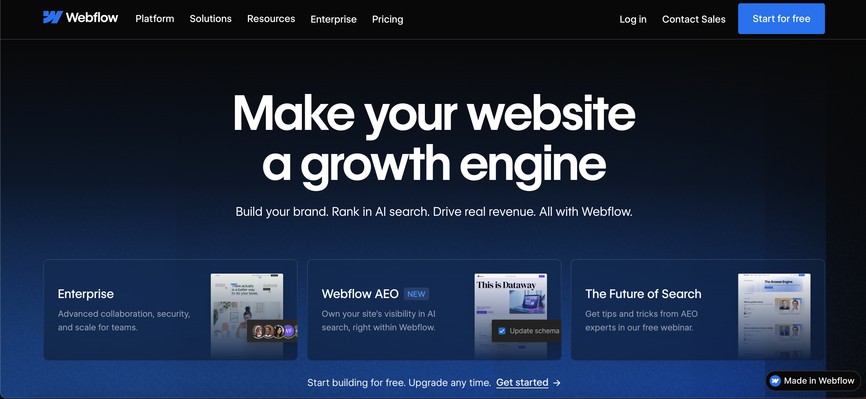
Think about Webflow, the website building tool built specifically for designers and marketing teams who do not want to write code. Their homepage does not say something generic like "build websites faster". It tells you exactly who it is for, what it replaces, and what makes it different. That specificity is what converts. A visitor knows within five seconds whether this product is for them.
Most SaaS websites do the opposite. They lead with taglines that sound polished but say nothing. A first-time visitor has no idea what the product does or why they should care.
Here is the difference in practice:
The fix starts with your headline. It should answer one simple question: what does this do and who is it for? Not a mission statement, not a feature list. A clear, specific promise to a specific kind of person.
A strong homepage gets a few things right. The headline names who the product is for or what problem it solves. The subheadline adds one layer of context without repeating the headline. There is one clear CTA above the fold, not two or three competing ones. Social proof shows outcomes, not just logo strips. The voice stays consistent from top to bottom. And a first-time visitor should be able to explain what the product does within ten seconds of landing on the page.
The Messaging Gap Nobody Talks About
There is a specific problem that shows up in post-PMF SaaS companies. The product has evolved, new features have been added, and new customer segments have been discovered, but the website still reflects where the company was 18 months ago.
This is called a messaging gap. The website is technically functional. The product is genuinely good. But the language on the site no longer matches the real pain points of the customers the sales team is actually closing today. Visitors arrive, read copy that does not speak to their situation, and leave.
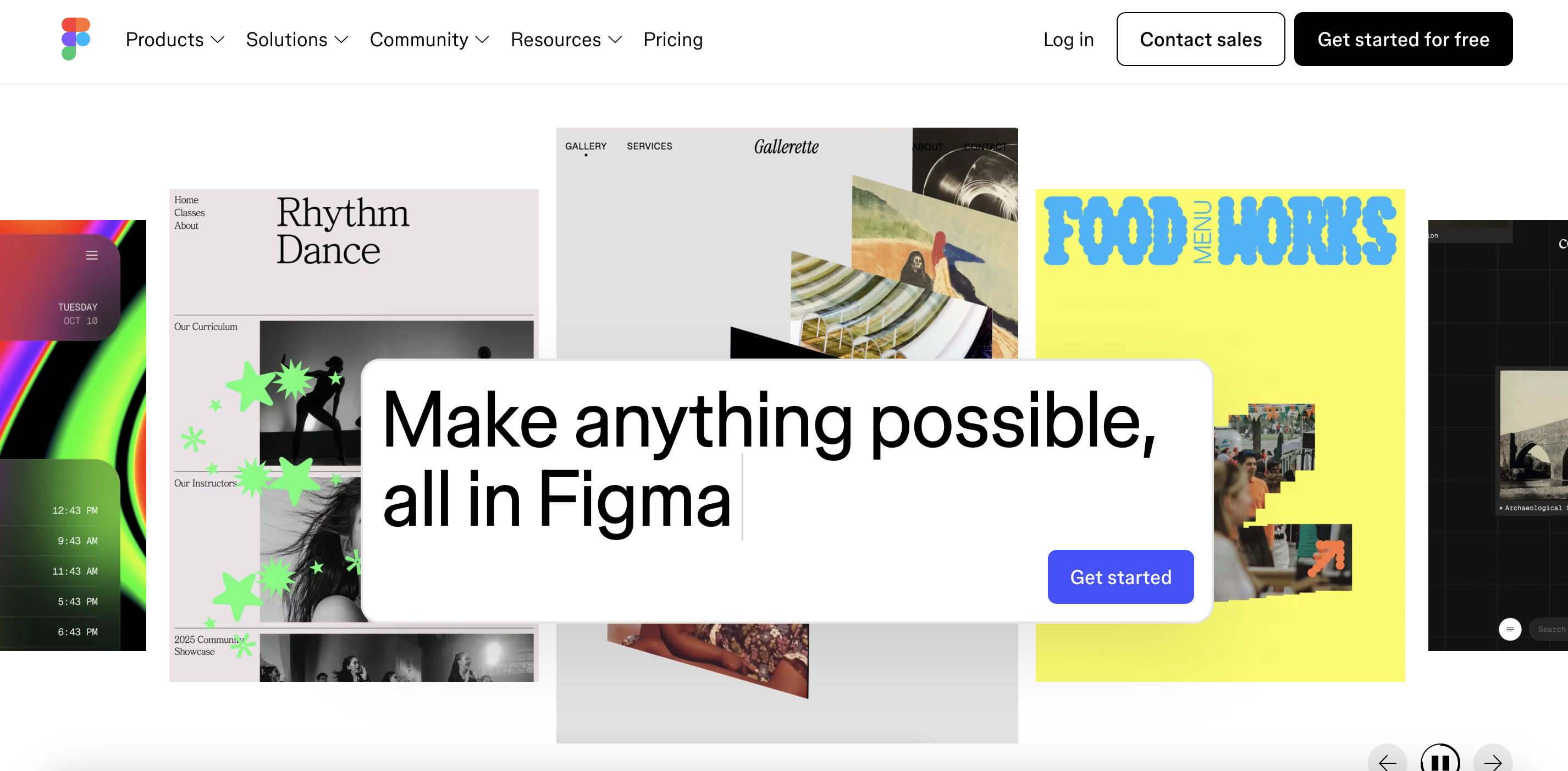
A good example of a company that refined its messaging is Figma. As the platform expanded beyond designers to serve product managers, developers, marketers, and entire product teams, its homepage messaging evolved too. Rather than talking only about interface design, it now leads with "Make Anything Possible in Figma," reinforcing collaboration, AI-powered workflows, and end-to-end product creation. The product changed, but just as importantly, the way Figma explained its value changed to match how customers actually used it.
How to spot a messaging gap in your own company:
Ask your last five customers why they signed up. Write down the exact words they use. Now open your homepage. If the language on the page does not match the language your customers use to describe their own problem, you have a messaging gap.
Other signs: your sales team regularly has to explain the product differently from how the website describes it, or you keep attracting trial users who churn quickly because the product is not what they expected based on your marketing.
Fixing this means going back to basics: why do customers buy? What problem were they dealing with before they found you? What did they try before? What finally made them sign up? The answers to those questions should become the foundation of your homepage copy, because those are the exact words your real customers use to describe their own pain.
Why Your Pricing Page Is Quietly Killing Conversions
The pricing page is one of the most visited pages on any SaaS site and also one of the most commonly broken.
The two problems that kill conversions here are complexity and ambiguity. Complexity looks like five pricing tiers with 30 feature comparisons. Ambiguity looks like not telling visitors whether a credit card is required, what happens at the end of a free trial, or what the actual difference is between your Pro and Business plans.
Credit card required vs no credit card
This one decision has a bigger impact than most founders realise. Requiring a credit card upfront reduces trial signups significantly, sometimes by 40 to 60 per cent. The visitors who do sign up may be more serious, but for most early-stage SaaS companies, volume matters more. Get people into the product first. Convert them once they have seen the value. If you do require a card, say so clearly and explain why. "We ask for a card to prevent abuse, but you will not be charged until day 14" removes far more doubt than silence does.
Annual discount strategy
Offering an annual plan at a discount is one of the most effective ways to improve cash flow and reduce churn at the same time. The standard approach is a 15 to 20 per cent discount for paying annually. The key is how you present it. Default the toggle to annual on your pricing page rather than monthly. Most visitors do not change defaults. If your monthly plan is what they see first, that is what they compare everything against. If annual is the default, the comparison shifts in your favour.
Feature comparison mistakes
Most SaaS pricing pages list too many features and give them all equal weight. The visitor ends up scanning a wall of checkboxes and still cannot tell what the real difference between plans is.
A better approach is to lead with the one or two things that actually separate each tier, and push the full feature list below the fold for people who want to dig in. Notion does this well. Their pricing page is clean, the tiers are clearly differentiated by use case rather than feature count, and the free tier is anchored clearly enough that visitors understand the value before they ever pay anything.
Other pricing page fixes worth making:
- Add a one-line description of who each plan is for, not just what it includes
- Show the price in a way that feels familiar to your buyer (per seat, per month, billed annually)
- Include a short FAQ directly on the pricing page covering the most common objections
- Make the most popular plan visually distinct
- If you have an enterprise tier, give it a real starting price or a clear reason to contact sales. "Contact us" with no context is a conversion dead end for most visitors.
Three Specific Things That Improve SaaS Conversion Rates
If you are looking at your funnel and trying to decide where to start, these three things produce the fastest results.
The first is your call-to-action copy. "Get Started" converts worse than "Start Your Free Trial". "Start Your Free Trial" converts worse than "Start Free, No Credit Card Required". Every word that removes a potential objection is doing real conversion work. This is a small change that requires no redesign and can produce meaningful results within days.
The second is your social proof. A logo strip that says "Trusted by 10,000 teams" does almost nothing. A short, specific customer quote that says "We cut our sprint planning time from three hours to 45 minutes" from a real person at a real company converts because it shows the outcome, not just the product. Tools like ClickUp and Hotjar use exactly this kind of outcome-driven proof on their homepages, and it works.
The third is your page load speed, which sounds boring but is not. According to Think with Google, 53 per cent of mobile visitors abandon a page that takes longer than three seconds to load. A widely cited industry stat puts the conversion drop at around 7 per cent for every additional second of load time. If your site loads slowly on mobile, you are losing conversions before a single word on your page is read.
How Traffic Source Affects Everything
Not all traffic is worth optimising for. If you are running paid ads that bring in visitors who are not your ideal customer, no amount of conversion optimisation will fix that. You are trying to optimise a leaky bucket.
The highest-converting SaaS websites tend to attract the right people from the start, through SEO content, comparison pages, or thought leadership that pulls in people already aware of the problem. When the person arriving already understands what they are looking for, conversion is much easier. The website just needs to confirm what they already suspect: that your product is the right answer.
This is why SaaS website positioning and conversion optimisation are not two separate problems. They are the same problem viewed from different angles. Getting the message right is what makes everything else work.
.jpg)
Before You Optimise Anything, Answer This
When visitors leave your site without converting, ask yourself one question: are they the wrong people, or are they the right people who were not convinced?
If it is the first, your traffic strategy needs work. If it is the second, your messaging needs work. Most SaaS companies at the seed to Series A stage are dealing with the second problem while blaming the first.
The good news is that messaging is fixable. The website is not a permanent thing. It is a test you run continuously until you find what converts.
SaaS Website Audit: Self-Diagnose Before You Optimise
Go through this honestly. The more boxes you tick, the more likely your conversion problem is a messaging and clarity problem rather than a traffic problem.
Homepage
Messaging
Pricing page
Technical
If you ticked five or more across these sections, you have a conversion problem that is costing you customers right now.
Is Your Website Costing You the Right Customers?
If you have read this far, you probably already feel it: something on your website is not landing the way it should. Maybe traffic is steady but signups are flat. Maybe you are getting demo requests, but the quality is off. Maybe your free trial numbers look fine, but paid conversion is low.
These are all symptoms of the same root issue: your website is not clearly telling the right people why your product is built for them.
That is exactly the kind of problem we work on at Minute Creative. We help B2B SaaS founders at the Seed and post-PMF stage tighten their website positioning and messaging so that the right visitors actually convert. Not through guesswork, but through a structured process of understanding your buyers, identifying the gaps in your current messaging, and rewriting the pages that matter most.
If any of this sounds familiar, we are here to help you figure out where to start.